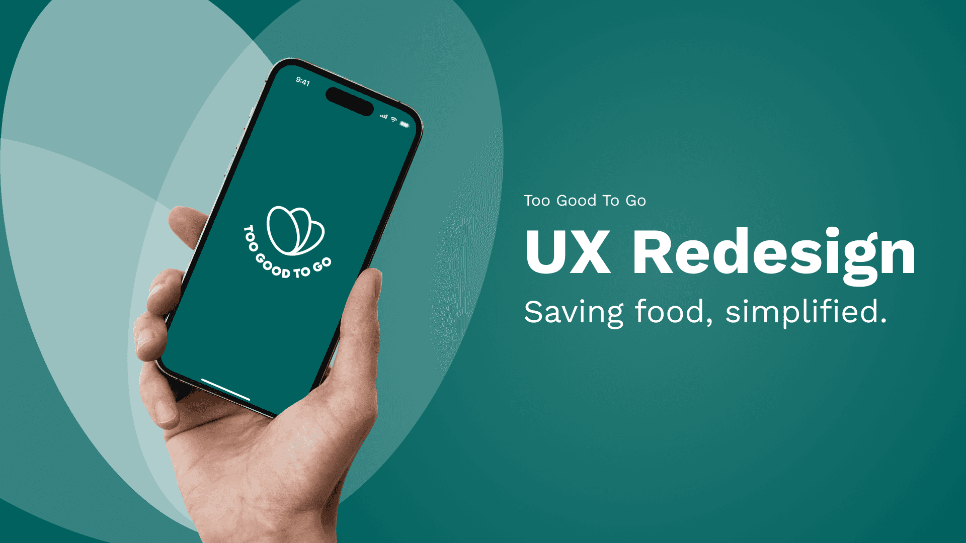
Too Good To Go
UX Redesign, Case Study
2025
SUMMARY
MAKING FOOD-SAVING EASIER TO LOVE.
Too Good To Go fights food waste - but frequent users often stumbled through an experience that made the process harder than it should be. This project showcases the full UX process: from research and testing to redesigning filters, navigation, and user motivation.
Focused on simplifying core interactions like filtering and browsing
Used research insights from surveys (n=15), interviews (n=5),
and usability tests (n=2)Designed a concept to make re-using the app more rewarding and intuitive
CHALLENGE
GREAT MISSION. FRUSTRATING EXPERIENCE.
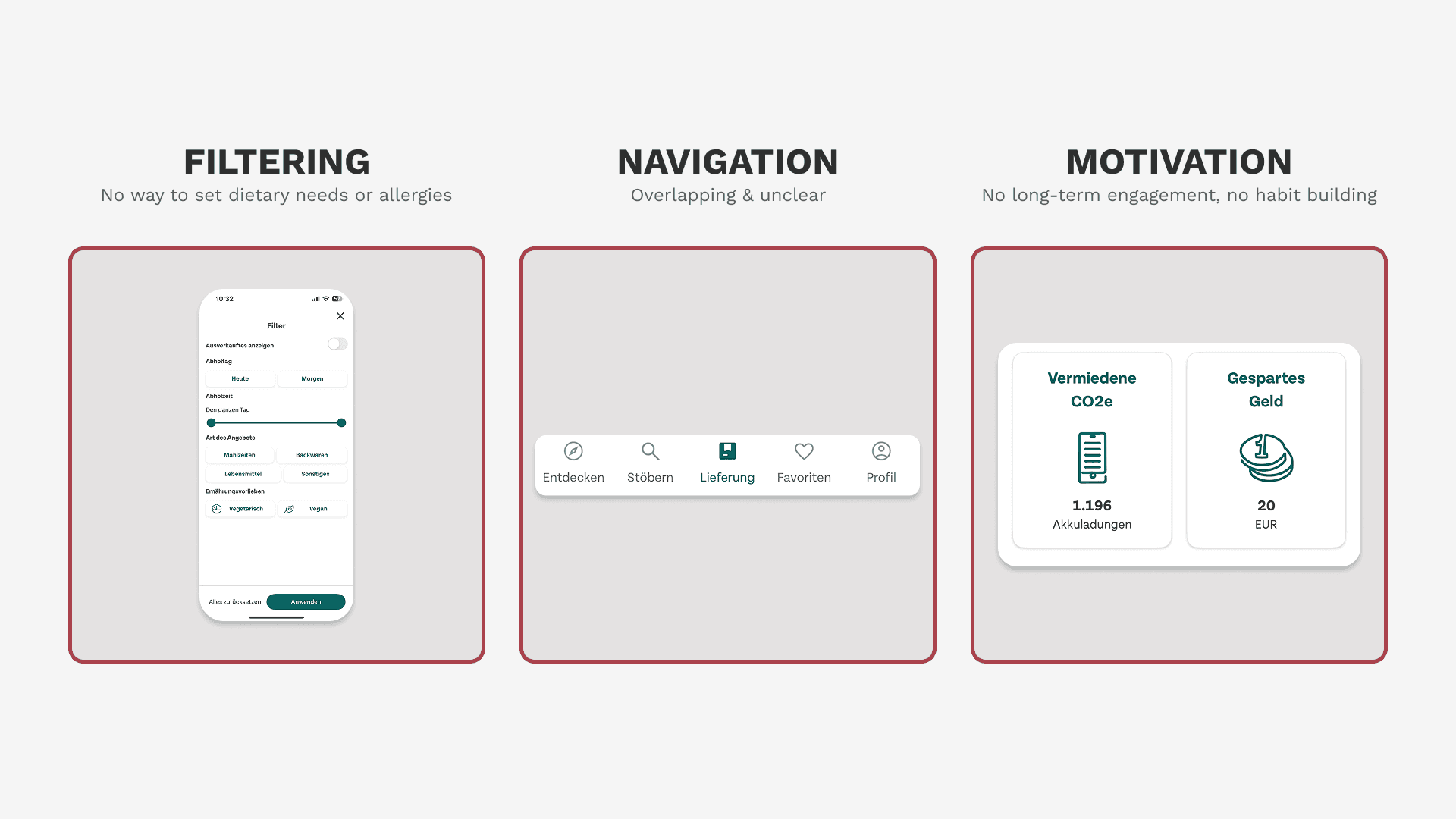
Too Good To Go helps reduce food waste - but the app gets in its own way. As a regular user, I noticed:
Limited filtering options
Redundant navigation
The lack of motivation to use it more often. I wanted to dig deeper: What makes people drop off? And how could it be fixed?
RESEARCH & INSIGHTS
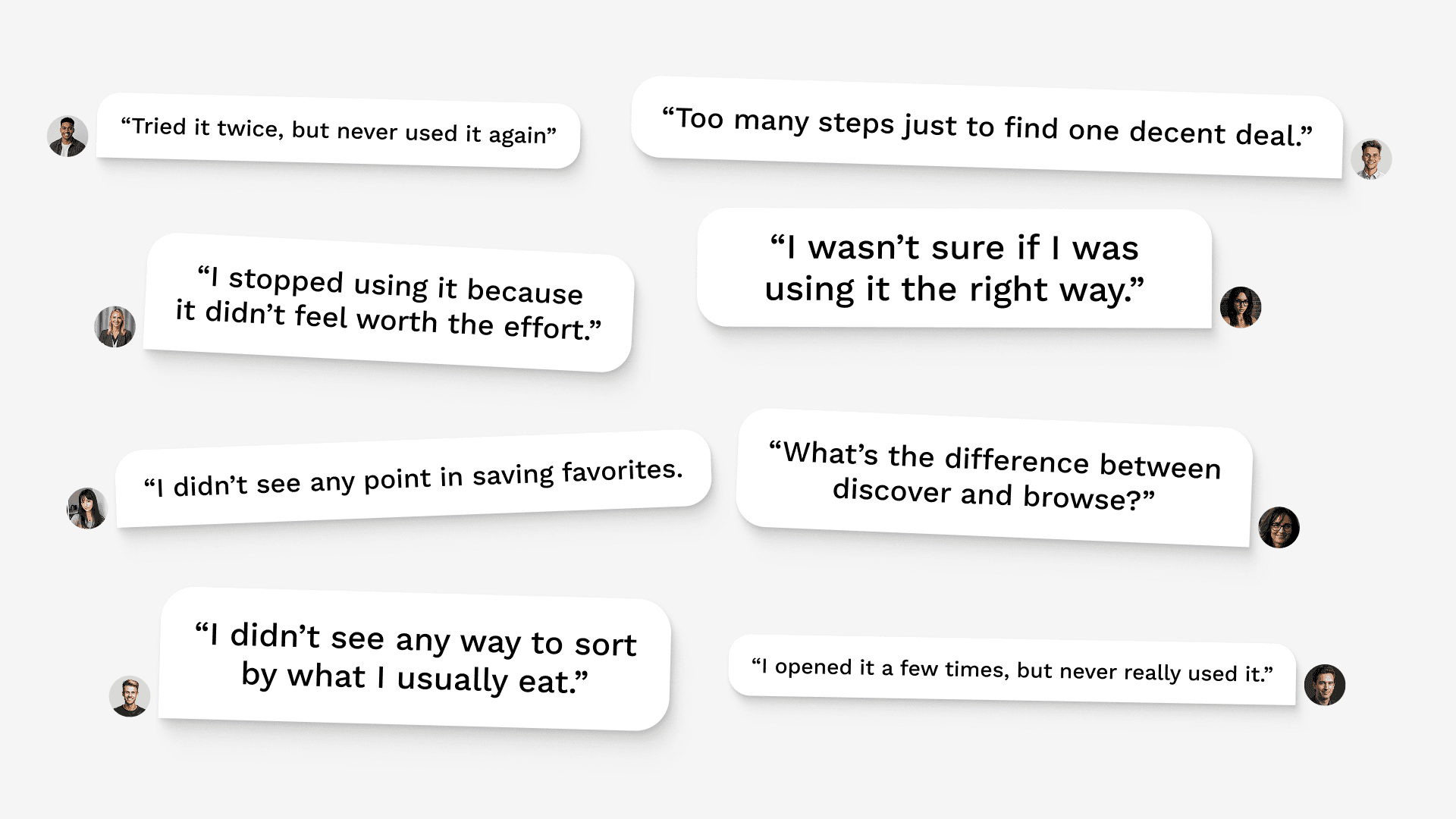
USERS LIKED THE IDEA - BUT OFTEN FELT STUCK OR INDIFFERENT
To understand user behavior and friction points, I used a mixed-method approach:
15 survey responses
5 user interviews
2 on-site usability tests with a lo-fi prototype
Across all methods, three themes emerged:
Filtering didn’t reflect real-world needs (e.g. dietary or allergy info)
Navigation was confusing and inconsistent
No emotional or functional reason to come back
Target groups (from survey & interviews):
Students: budget-driven, sustainability-minded
Young professionals: time-strapped, convenience-seeking
"Picky eaters": often limited by missing dietary filters
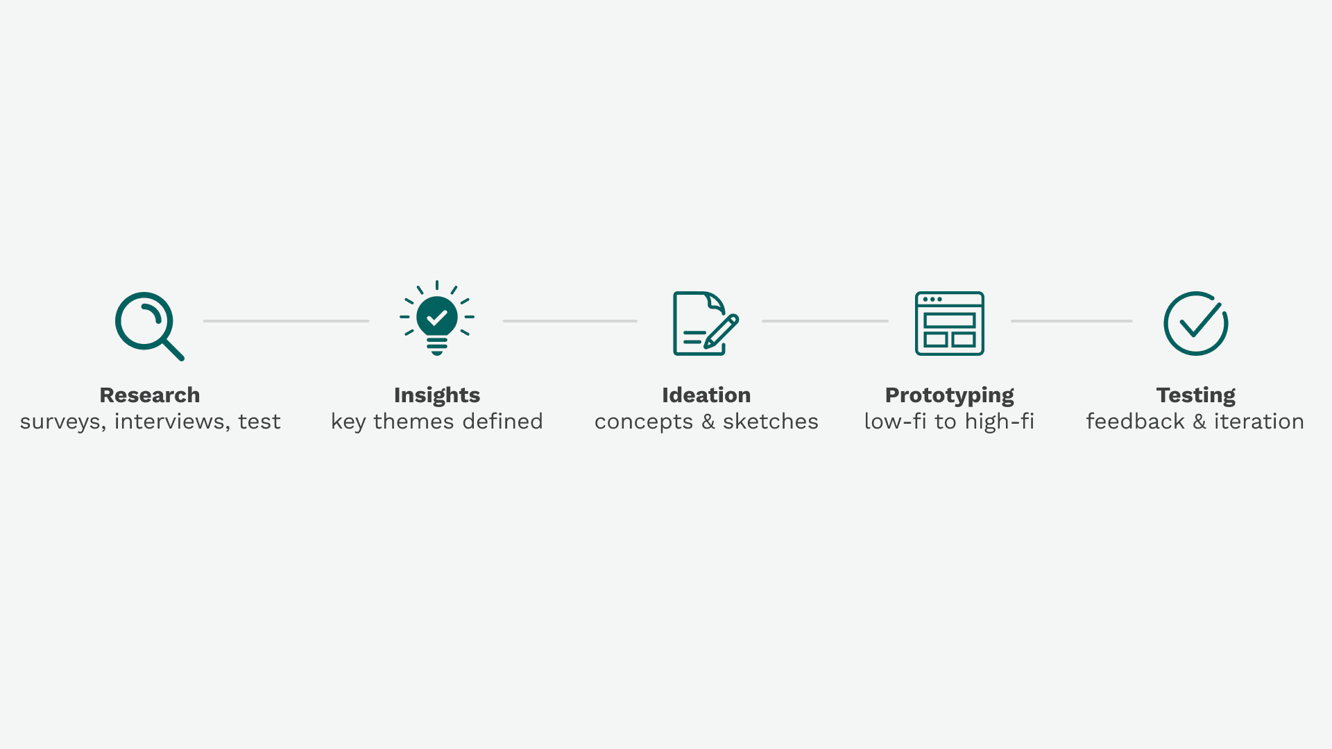
PROCESS
TRANSLATING INSIGHTS INTO STRUCTURE
From initial research to tested high-fidelity designs, the process followed a structured and iterative approach.
Defined key opportunity areas: filtering, navigation, motivation
Sketched out flows and low-fidelity screens in Figma
Built out the high-fidelity screens and polished them for presentation.
Each decision was guided by user insight, not assumptions. Final concepts were tested for usability and logic.
OUTCOME
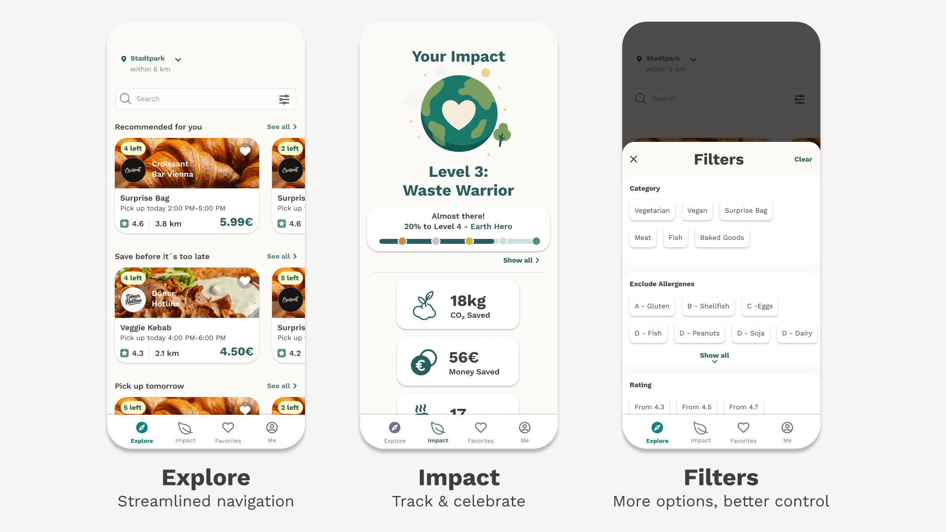
SIMPLER FLOW. SMARTER FILTER. CLEARER FEEDBACK.
The redesigned experience included:
A unified Explore section that replaces “Discover” and “Browse”
Improved bottom navigation with clearer structure
Filters for cuisine, dietary needs, portion size, pickup time, and more
Gamification concept to increase long-term motivation (e.g. incentive based system with levels and stats)
While some features were only partially implemented in the prototype, they showed promise in early tests.
REFLECTIONS & LEARNINGS
THINKING IN SYSTEMS - NOT JUST SCREENS.
Every design choice is a tradeoff. The process taught me to prioritize
and explain those decisions.Gamification isn’t a silver bullet - but thoughtful incentives can shift behavior.
Research > gut feeling. Structured and research based work made everything easier.
It may sound obvious, but messy files lead to messy thinking. A clear Figma setup sharpened every step of the process.
If extended, I’d explore more emotional rewards - and how motion and micro-interactions could bring delight to mundane moments.